Matplotlib 数据探索
Matplotlib 是一个 Python 的数据可视化库,它能够轻松创建各种类型的图表和图形;Matplotlib 可以在 Jupyter Notebooks、交互式应用程序和脚本中使用,并支持多种绘图样式和格式;
Matplotlib 最初是为科学计算而设计的,可以用于绘制折线图、散点图、条形图、 面积图、饼图、直方图等多种图表类型。除了基本的图表类型之外,Matplotlib 还支持更高级的数据可视化,如 3D 绘图、动画、地图绘制等功能;
Matplotlib 提供了丰富的 API,包括函数式接口和面向对象接口,用户可以根据自己的需要选择不同的接口进行操作。利用 Matplotlib,用户可以实现复杂的数据可视化,探索数据中的模式和关系,从而更好地理解数据并做出有意义的分析和预测;
除了提供 API 接口,Matplotlib 还有一些其他的特性,例如:
-
支持多种输出格式:Matplotlib 可以将图表输出为多种格式,包括 PNG、PDF、SVG 等常见的图像格式;
-
多种样式风格:Matplotlib 内置了多种样式风格,用户可以通过设置不同的风格来快速改变图表的样式;
-
交互式可视化:Matplotlib 提供了多种交互式功能,如缩放、平移、旋转等,用户可以通过这些功能对图表进行交互式操作;
-
支持 LaTeX 公式:Matplotlib 支持在图表中使用 LaTeX 公式,从而方便地绘制包含数学符号和公式的图表;
总之,Matplotlib 是一个功能强大的数据可视化库,提供了丰富的 API 和多种样式风格�,可以帮助用户轻松创建各种类型的图表和图形,从而更好地探索和理解数据;
matplotlib 官网
1. 图的结构
使用 numpy 组织数据, 使用 matplotlib API 进行数据图像绘制;
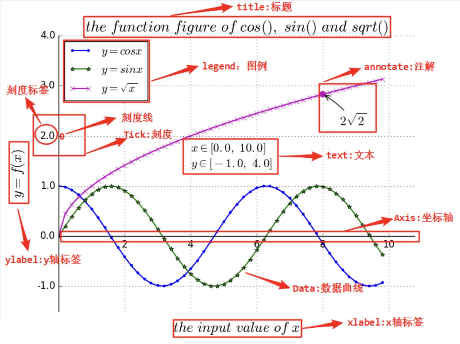
一幅数据图基本上包括如下结构:
Data,数据区,包括数据点、描绘形状;Axis,坐标轴,包括 X 轴、 Y 轴及其标签、刻度尺及其标签;Title,标题,数据图的描述;Legend,图例,区分图中包含的多种曲线或不同分类的数据;Text,图形文本;Annotate,注解;
2. 绘图步骤
- 导入 matplotlib 包相关工具包;
- 准备数据,numpy 数组存储;
- 绘制原始曲线;
- 配置标题、坐标轴、刻度、图例;
- 添加文字说明、注解;
- 显示、保存绘图结果;
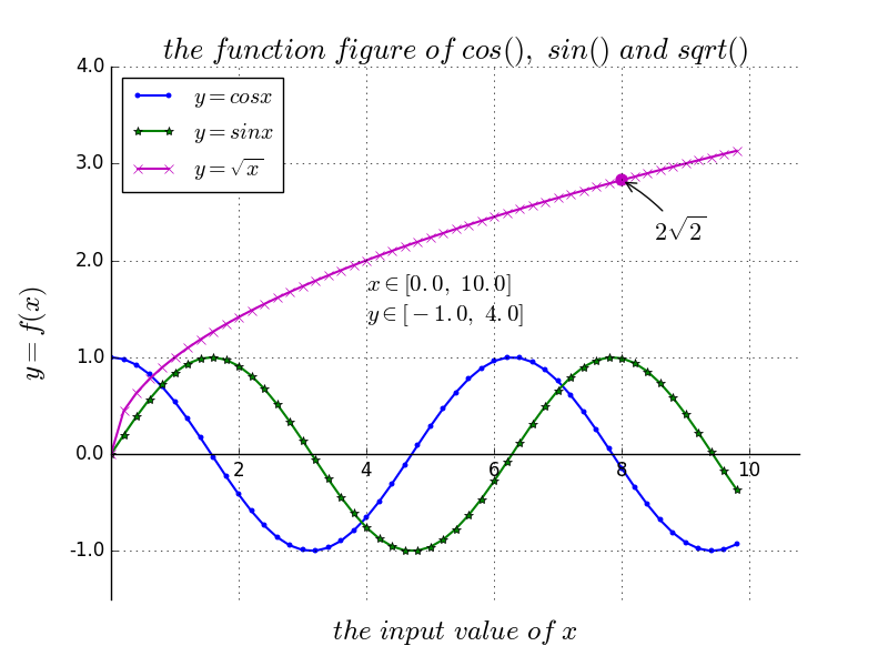
示例:con、sin、sqrt 函数的完整图像
1. 导包
# 让 matplotlib 绘制的图嵌在当前页面中
%matplotlib inline
import numpy as np
import matplotlib.pyplot as plt
from pylab import *
2. 准备数据
# 从 0. 开始 间隔为 0.2 的 10 以前的所有数
x = np.arange(0.,10, 0.2)
y1 = np.cos(x)
y2 = np.sin(x)
y3 = np.sqrt(x)
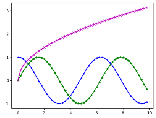
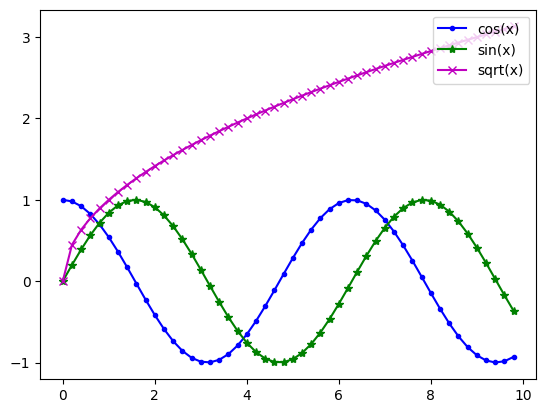
3. 绘制简单曲线
# linewidth
plt.plot(x, y1, color='blue', linewidth=1.5,
         linestyle='-', marker='.', label=r'$y = cos{x}$')
plt.plot(x, y2, color='green', linewidth=1.5,
         linestyle='-', marker='*', label=r'$y = sin{x}$')
plt.plot(x, y3, color='m', linewidth=1.5, linestyle='-',
         marker='x', label=r'$y = \sqrt{x}$')
4. color 参数
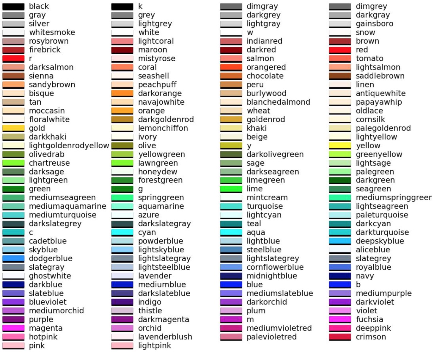
- r 红色
- g 绿色
- b 蓝色
- c cyan
- m 紫色
- y 土黄色
- k 黑色
- w 白色
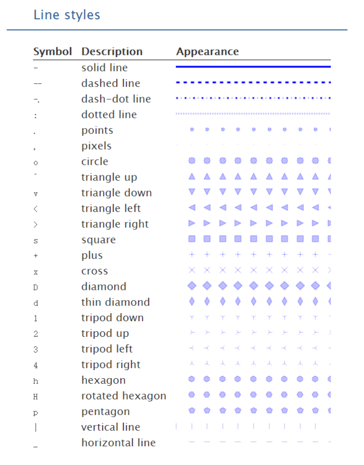
5. linestyle 线条样式
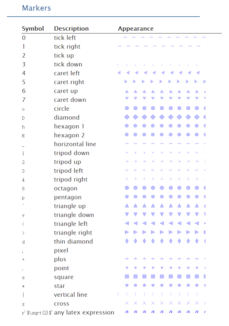
6. marker 标记
7. 坐标轴
# 坐标轴上移
ax = plt.subplot(111)
# 去掉右边的边框线
ax.spines['right'].set_color('none')
# 去掉上边的边框线
ax.spines['top'].set_color('none')

# 移动下边边框线,相当于移动 X 轴
ax.xaxis.set_ticks_position('bottom')
ax.spines['bottom'].set_position(('data', 0))

# 移动左边边框线,相当于移动 y 轴
ax.yaxis.set_ticks_position('left')
ax.spines['left'].set_position(('data', 0))

8. 刻度尺间隔 lim、刻度标签 ticks
# 设置 x, y 轴的刻度取值范围
plt.xlim(x.min()*1.1, x.max()*1.1)
plt.ylim(-1.5, 4.0)

# 设置 x, y 轴的刻度标签值
plt.xticks([2, 4, 6, 8, 10], [r'2', r'4', r'6', r'8', r'10'])
plt.yticks([-1.0, 0.0, 1.0, 2.0, 3.0, 4.0],
    [r'-1.0', r'0.0', r'1.0', r'2.0', r'3.0', r'4.0'])

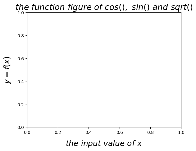
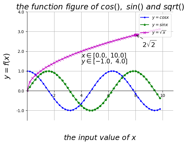
9. 设置 X、Y 坐标轴和标题
# 设置标题、x 轴、y 轴
plt.title(r'$the \ function \ figure \ of \ cos(), \ sin() \ and \ sqrt()$', fontsize=19)
plt.xlabel(r'$the \ input \ value \ of \ x$', fontsize=18, labelpad=10.8)
plt.ylabel(r'$y = f(x)$', fontsize=18, labelpad=12.5)
10. 文字描述与注解
# 数据图中添加文字描述 text
plt.text(1., 1.38, r'$x \in [0.0, \ 10.0]$', color='k', fontsize=15)
plt.text(1., 1.18, r'$y \in [-1.0, \ 4.0]$', color='k', fontsize=15)
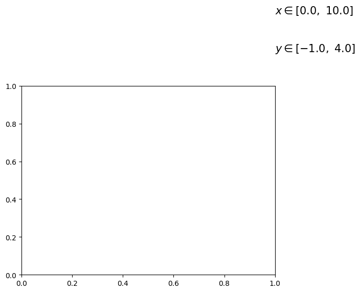
# 特殊点添加注解
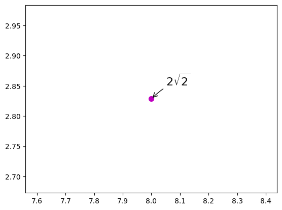
plt.scatter([8,], [np.sqrt(8),], 50, color='m') # 使用散点图放大当前点
plt.annotate(r'$2\sqrt{2}$', xy=(8, np.sqrt(8)), xytext=(8.05, 2.85), fontsize=16, color='#090909',
arrowprops=dict(arrowstyle='->', connectionstyle='arc3, rad=0.1', color='#090909'))
11. 图例设置
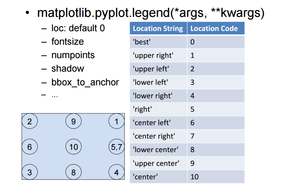
# 在 plt.plot 函数中添加 label 参数后,使用 plt.legend(loc=’up right’)
# 或 不使用参数 label, 直接使用如下命令:
plt.plot(x, y1, color='blue', linewidth=1.5,
         linestyle='-', marker='.', label=r'$y = cos{x}$')
plt.plot(x, y2, color='green', linewidth=1.5,
         linestyle='-', marker='*', label=r'$y = sin{x}$')
plt.plot(x, y3, color='m', linewidth=1.5, linestyle='-',
         marker='x', label=r'$y = \sqrt{x}$')
plt.legend(['cos(x)', 'sin(x)', 'sqrt(x)'], loc='upper right')
12. 网格线
plt.grid(True)

13. 显示与保存
# 显示
plt.show()
# 保存
savefig('.././assets/03-matplotlib/plot3d_ex.png', dpi=48)
3. 完整图例
# coding:utf-8

import numpy as np
import matplotlib.pyplot as plt
from pylab import *

# 定义数据部分
x = np.arange(0., 10, 0.2)
y1 = np.cos(x)
y2 = np.sin(x)
y3 = np.sqrt(x)

# 绘制 3 条函数曲线
plt.plot(x, y1, color='blue', linewidth=1.5,
         linestyle='-', marker='.', label=r'$y = cos{x}$')
plt.plot(x, y2, color='green', linewidth=1.5,
         linestyle='-', marker='*', label=r'$y = sin{x}$')
plt.plot(x, y3, color='m', linewidth=1.5, linestyle='-',
         marker='x', label=r'$y = \sqrt{x}$')

# 坐标轴上移
ax = plt.subplot(111)
ax.spines['right'].set_color('none')     # 去掉右边的边框线
ax.spines['top'].set_color('none')       # 去掉上边的边框线

# 移动下边边框线,相当于移动 X 轴
ax.xaxis.set_ticks_position('bottom')
ax.spines['bottom'].set_position(('data', 0))

# 移动左边边框线,相当于移动 y 轴
ax.yaxis.set_ticks_position('left')
ax.spines['left'].set_position(('data', 0))

# 设置 x, y 轴的取值范围
plt.xlim(x.min()*1.1, x.max()*1.1)
plt.ylim(-1.5, 4.0)

# 设置 x, y 轴的刻度值
plt.xticks([2, 4, 6, 8, 10], [r'2', r'4', r'6', r'8', r'10'])
plt.yticks([-1.0, 0.0, 1.0, 2.0, 3.0, 4.0],
           [r'-1.0', r'0.0', r'1.0', r'2.0', r'3.0', r'4.0'])

# 添加文字
plt.text(4, 1.68, r'$x \in [0.0, \ 10.0]$', color='k', fontsize=15)
plt.text(4, 1.38, r'$y \in [-1.0, \ 4.0]$', color='k', fontsize=15)

# 特殊点添加注解
plt.scatter([8,], [np.sqrt(8),], 50, color='m')  # 使用散点图放大当前点
plt.annotate(r'$2\sqrt{2}$', xy=(8, np.sqrt(8)), xytext=(8.5, 2.2), fontsize=16, color='#090909',
             arrowprops=dict(arrowstyle='->', connectionstyle='arc3, rad=0.1', color='#090909'))

# 设置标题、x轴、y轴
plt.title(
    r'$the \ function \ figure \ of \ cos(), \ sin() \ and \ sqrt()$', fontsize=19)
plt.xlabel(r'$the \ input \ value \ of \ x$', fontsize=18, labelpad=88.8)
plt.ylabel(r'$y = f(x)$', fontsize=18, labelpad=12.5)

# 设置图例及位置
plt.legend(loc='upper right')
# plt.legend(['cos(x)', 'sin(x)', 'sqrt(x)'], loc='up right')

# 显示网格线
plt.grid(True)

# 显示绘图
plt.show()
4. 常用图形
曲线图,matplotlib.pyplot.plot(data);灰度图,matplotlib.pyplot.hist(data);散点图,matplotlib.pyplot.scatter(data);箱式图,matplotlib.pyplot.boxplot(data);
1. 曲线图
x = np.arange(-5, 5, 0.1)
y = x ** 2
z = y ** 2
plt.plot(x, y)
plt.plot(x, z)

2. 灰度图
x = np.random.normal(size=1000)
plt.hist(x, bins=10)

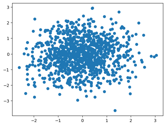
3. 散点图
x = np.random.normal(size=1000)
y = np.random.normal(size=1000)
plt.scatter(x,y)
4. 箱式图
plt.boxplot(x)

- 上边缘(Q3+1.5IQR)、下边缘(Q1-1.5IQR)、IQR=Q3-Q1
- 上四分位数(Q3)、下四分位数(Q1)
- 中位数
- 异常值
- 处理异常值时与 3 σ 标准的异同:统计边界是否受异常值影响、容忍度的大小
5. 应用案例:自行车租赁数据分析
关联分析、数值比较:散点图、曲线图;分布分析:灰度图、密度图;涉及分类的分析:柱状图、箱式图;
1. 导入数据
import pandas as pd
import urllib
import tempfile  # 创建临时文件系统
import shutil  # 文件操作
import zipfile  # 压缩解压缩

# 创建临时目录
temp_dir = tempfile.mkdtemp()
# 网络数据
data_source = 'http://archive.ics.uci.edu/ml/machine-learning-databases/00275/Bike-Sharing-Dataset.zip'
zipname = temp_dir + '/Bike-Sharing-Dataset.zip'
# 获得数据
urllib.request.urlretrieve(data_source, zipname)

# 创建一个 ZipFile 对象处理压缩文件
zip_ref = zipfile.ZipFile(zipname, 'r')
# 解压
zip_ref.extractall(temp_dir)
zip_ref.close()

daily_path = temp_dir + '/day.csv'
daily_data = pd.read_csv(daily_path)
# 把字符串数据转换成日期数据
daily_data['dteday'] = pd.to_datetime(daily_data['dteday'])
# 不关注的列
drop_list = ['instant', 'season', 'yr', 'mnth',
             'holiday', 'workingday', 'weathersit', 'atemp', 'hum']
# inplace = true 表示在对象上直接操作
daily_data.drop(drop_list, inplace=True, axis=1)

# 删除临时文件目录
shutil.rmtree(temp_dir)

# 查看数据
daily_data.head(10)
      dteday  weekday      temp  windspeed  casual  registered   cnt
0 2011-01-01        6  0.344167   0.160446     331         654   985
1 2011-01-02        0  0.363478   0.248539     131         670   801
2 2011-01-03        1  0.196364   0.248309     120        1229  1349
3 2011-01-04        2  0.200000   0.160296     108        1454  1562
4 2011-01-05        3  0.226957   0.186900      82        1518  1600
5 2011-01-06        4  0.204348   0.089565      88        1518  1606
6 2011-01-07        5  0.196522   0.168726     148        1362  1510
7 2011-01-08        6  0.165000   0.266804      68         891   959
8 2011-01-09        0  0.138333   0.361950      54         768   822
9 2011-01-10        1  0.150833   0.223267      41        1280  1321
2. 配置参数
# 引入 3.x 版本的出发和打印
from __future__ import division, print_function
from matplotlib import pyplot as plt
import pandas as pd
import numpy as np
# 在 notebook 中显示绘图结果
%matplotlib inline
# 设置一些全局的资源参数
import matplotlib
# 设置��图片尺寸 14 x 7
# rc: resource configuration
matplotlib.rc('figure', figsize=(14, 7))
# 设置字体 14
matplotlib.rc('font', size = 14)
# 不显示顶部和右侧的坐标线
matplotlib.rc('axes.spines', top = False, right = False)
# 不显示网格
matplotlib.rc('axes', grid = False)
# 设置背景颜色是白色
matplotlib.rc('axes', facecolor = 'white')
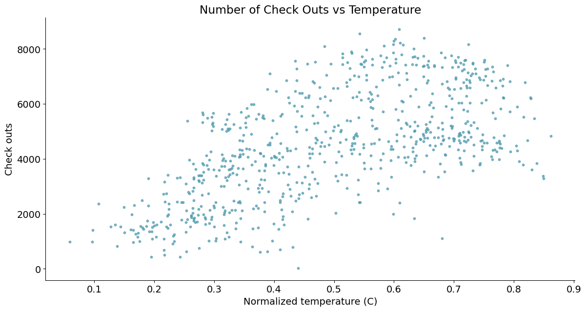
3. 关联分析(散点图 - 分析变量关系)
# 包装一个散点图的函数便于复用
def scatterplot(x_data, y_data, x_label, y_label, title):

    # 创建一个绘图对象
    fig, ax = plt.subplots()

    # 设置数据、点的大小、点的颜色和透明度
    # http://www.114la.com/other/rgb.htm
    ax.scatter(x_data, y_data, s=10, color='#539caf', alpha=0.75)

    # 添加标题和坐标说明
    ax.set_title(title)
    ax.set_xlabel(x_label)
    ax.set_ylabel(y_label)
    plt.show()


# 绘制散点图
scatterplot(x_data=daily_data['temp'], y_data=daily_data['cnt'], x_label='Normalized temperature (C)',
            y_label='Check outs', title='Number of Check Outs vs Temperature')
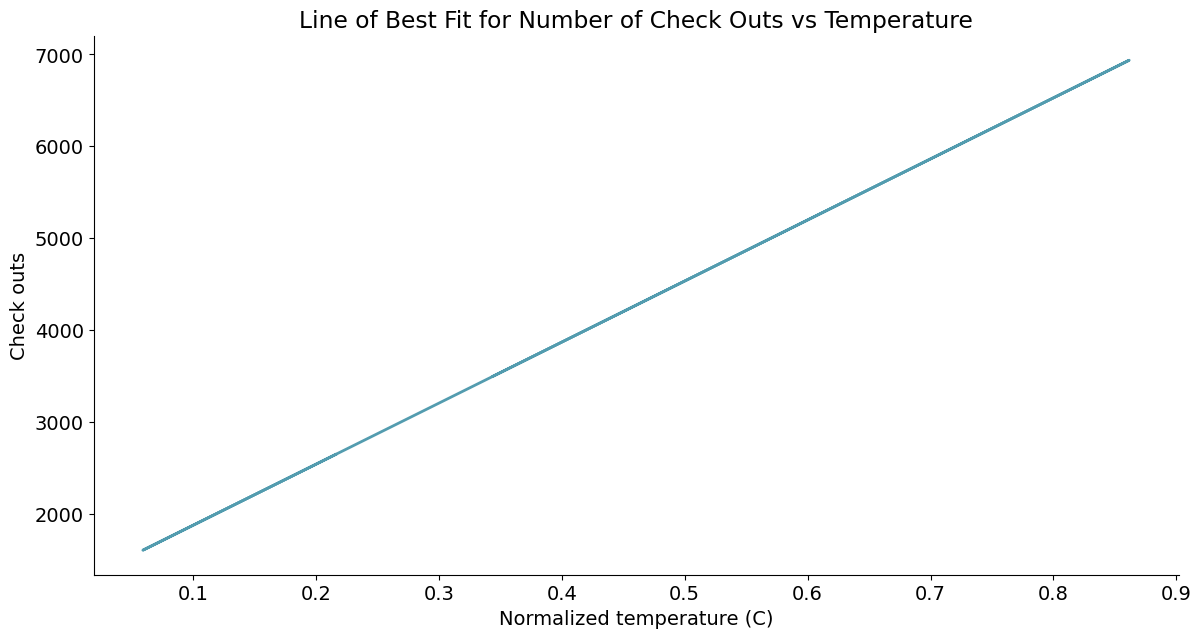
4. 关联分析(曲线图 - 拟合变量关系)
# 线性回归 最小二乘
import statsmodels.api as sm

# 获得汇总信息
from statsmodels.stats.outliers_influence import summary_table

# 线性回归增加常数项 y=kx+b
x = sm.add_constant(daily_data['temp'])
y = daily_data['cnt']

# 普通最小二乘模型,ordinary least square model
regr = sm.OLS(y, x)
res = regr.fit()

# 从模型获得拟合数据
# 置信水平alpha=5%,st数据汇总,data数据详情,ss2数据列名
st, data, ss2 = summary_table(res, alpha=0.05)
fitted_values = data[:, 2]

# 包装曲线绘制函数
def lineplot(x_data, y_data, x_label, y_label, title):
    # 创建绘图对象
    _, ax = plt.subplots()

    # 绘制拟合曲线,lw=linewidth,alpha=transparancy
    ax.plot(x_data, y_data, lw=2, color='#539caf', alpha=1)

    # 添加标题和坐标说明
    ax.set_title(title)
    ax.set_xlabel(x_label)
    ax.set_ylabel(y_label)


# 调用绘图函数
lineplot(x_data=daily_data['temp'], y_data=fitted_values, x_label='Normalized temperature (C)',
         y_label='Check outs', title='Line of Best Fit for Number of Check Outs vs Temperature')
>>> x.size
1462

>>> type(regr)
statsmodels.regression.linear_model.OLS

>>> # st.head()
>>> pd.DataFrame.from_records(st.data).head()
    0           1            2             3            4            5   \
0  Obs     Dep Var    Predicted     Std Error      Mean ci      Mean ci
1       Population        Value  Mean Predict      95% low      95% upp
2  1.0       985.0  3500.155357     72.432281  3357.954604   3642.35611
3  2.0       801.0  3628.394108     68.827331  3493.270679  3763.517537
4  3.0      1349.0  2518.638497    106.979293  2308.614241  2728.662754

           6            7            8            9         10        11
0  Predict ci   Predict ci     Residual    Std Error   Student    Cook's
1     95% low      95% upp                  Residual  Residual         D
2  533.478562  6466.832152 -2515.155357  1507.649519 -1.668263  0.003212
3  662.048124  6594.740092 -2827.394108  1507.818393 -1.875156  0.003663
4 -452.061814  5489.338809 -1169.638497  1505.592554 -0.776863  0.001524

>>> ss2
['Obs',
 'Dep Var\nPopulation',
 'Predicted\nValue',
 'Std Error\nMean Predict',
 'Mean ci\n95% low',
 'Mean ci\n95% upp',
 'Predict ci\n95% low',
 'Predict ci\n95% upp',
 'Residual',
 'Std Error\nResidual',
 'Student\nResidual',
 "Cook's\nD"]

>>> data
array([[ 1.00000000e+00,  9.85000000e+02,  3.50015536e+03, ...,
         1.50764952e+03, -1.66826263e+00,  3.21190276e-03],
       [ 2.00000000e+00,  8.01000000e+02,  3.62839411e+03, ...,
         1.50781839e+03, -1.87515560e+00,  3.66326560e-03],
       [ 3.00000000e+00,  1.34900000e+03,  2.51863850e+03, ...,
         1.50559255e+03, -7.76862568e-01,  1.52350164e-03],
       ...,
       [ 7.29000000e+02,  1.34100000e+03,  2.89695311e+03, ...,
         1.50654569e+03, -1.03279517e+00,  2.01463700e-03],
       [ 7.30000000e+02,  1.79600000e+03,  2.91355488e+03, ...,
         1.50658291e+03, -7.41781203e-01,  1.02560619e-03],
       [ 7.31000000e+02,  2.72900000e+03,  2.64792648e+03, ...,
         1.50594093e+03,  5.38357901e-02,  6.64260501e-06]])
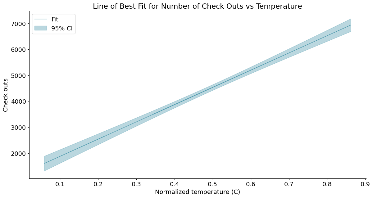
5. 带置信区间的曲线图 - 评估权限拟合结果
# 获得5%置信区间的上下界
predict_mean_ci_low, predict_mean_ci_upp = data[:, 4:6].T

# 创建置信区间DataFrame,上下界
CI_df = pd.DataFrame(columns=['x_data', 'low_CI', 'upper_CI'])
CI_df['x_data'] = daily_data['temp']
CI_df['low_CI'] = predict_mean_ci_low
CI_df['upper_CI'] = predict_mean_ci_upp
CI_df.sort_values('x_data', inplace=True)  # 根据x_data进行排序

# 绘制置信区间
def lineplotCI(x_data, y_data, sorted_x, low_CI, upper_CI, x_label, y_label, title):
    # 创建绘图对象
    _, ax = plt.subplots()

    # 绘制预测曲线
    ax.plot(x_data, y_data, lw=1, color='#539caf', alpha=1, label='Fit')
    # 绘制置信区间,顺序填充
    ax.fill_between(sorted_x, low_CI, upper_CI,
                    color='#539caf', alpha=0.4, label='95% CI')
    # 添加标题和坐标说明
    ax.set_title(title)
    ax.set_xlabel(x_label)
    ax.set_ylabel(y_label)

    # 显示图例,配合label参数,loc=“best”自适应方式
    ax.legend(loc='best')


# Call the function to create plot
lineplotCI(x_data=daily_data['temp'], y_data=fitted_values, sorted_x=CI_df['x_data'], low_CI=CI_df['low_CI'], upper_CI=CI_df['upper_CI'],
           x_label='Normalized temperature (C)', y_label='Check outs', title='Line of Best Fit for Number of Check Outs vs Temperature')
>>> predict_mean_ci_low
array([3357.95460434, 3493.2706787 , 2308.61424066, 2334.61511966,
       2527.1743799 , 2365.69916755, 2309.74422092, 2084.09224731,
       1892.90173201, 1982.55120771, 2113.4006319 , 2139.44397   ,
       2084.09224731, 2054.49814292, 2572.66032092, 2560.77755361,
       2161.68700285, 2453.71655445, 2991.06693905, 2774.47282774,
       2173.62331635, 1323.87879839, 1592.70114322, 1598.94940723,
       2502.34533239, 2459.66533233, 2298.85873944, 2359.48023561,
       2309.74422092, 2452.68101446, 2197.48538328, 2278.64410965,
       2762.61518008, 2241.31702524, 2415.40839107, 2572.66032092,
       2946.11512008, 2845.5587389 , 2483.46378131, 1867.43225439,
       1936.04737195, 2256.58702583, 2495.3642587 , 3163.28624958,
       3850.82088667, 2805.90262872, 3175.56105833, 3993.62059464,
       4568.15553475, 3741.55716105, 2941.746223  , 3070.07683526,
       2207.42834256, 2489.93178099, 3015.70611753, 3499.35231432,
       2922.47209315, 3353.11577628, 3797.57171434, 2810.02576103,
       3293.51825779, 2322.69524907, 2774.47282774, 3637.51586294,
       3584.30939921, 2774.98492788, 2993.37692847, 3016.98804377,
       3671.72232094, 3163.28624958, 3252.45565962, 3638.77413698,
       3224.62303583, 3169.4205805 , 3505.42562991, 3850.82088667,
       4687.81236982, 4241.92285953, 3275.92466748, 3956.7321869 ,
       4033.39618479, 3377.54137823, 2940.20709584, 2792.25173921,
       2804.0968969 , 2713.10649495, 2793.53874375, 3064.18335719,
       3046.49142163, 2821.86760563, 3046.49142163, 3152.54017204,
       3596.92375538, 4902.84424832, 3845.08751497, 3683.81159355,
       4004.99592   , 3299.37851782, 3346.2460944 , 3930.93527485,
...
       3016.98804377, 2916.56152591, 3217.22108861, 3486.43250237,
       3701.14990982, 3822.12298042, 3275.92466748, 3258.32254957,
       3234.84243973, 2804.0968969 , 2661.76079882, 2558.18822718,
       2984.90173382, 2643.9488419 , 2721.10770942, 2715.17095217,
       2715.17095217, 2732.96547894, 2447.76025905])
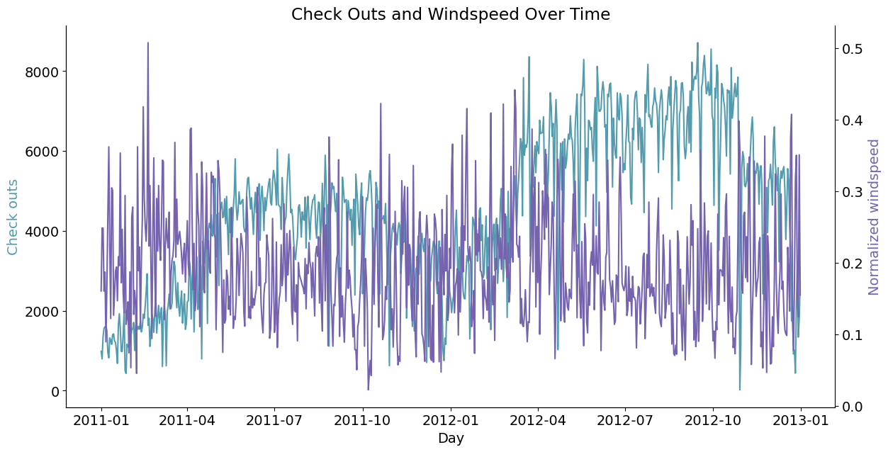
6. 双坐标曲线图
- 曲线拟合不满足置信阈值时,考虑增加独立变量;
- 分析不同尺度多变量的关系;
# 双纵坐标绘图函数
def lineplot2y(x_data, x_label, y1_data, y1_color, y1_label, y2_data, y2_color, y2_label, title):
    _, ax1 = plt.subplots()
    ax1.plot(x_data, y1_data, color=y1_color)
    # 添加标题和坐标说明
    ax1.set_ylabel(y1_label, color=y1_color)
    ax1.set_xlabel(x_label)
    ax1.set_title(title)

    ax2 = ax1.twinx()  # 两个绘图对象共享横坐标轴
    ax2.plot(x_data, y2_data, color=y2_color)
    ax2.set_ylabel(y2_label, color=y2_color)
    # 右侧坐标轴可见
    ax2.spines['right'].set_visible(True)


# 调用绘图函数
lineplot2y(x_data=daily_data['dteday'], x_label='Day', y1_data=daily_data['cnt'], y1_color='#539caf', y1_label='Check outs',
           y2_data=daily_data['windspeed'], y2_color='#7663b0', y2_label='Normalized windspeed', title='Check Outs and Windspeed Over Time')
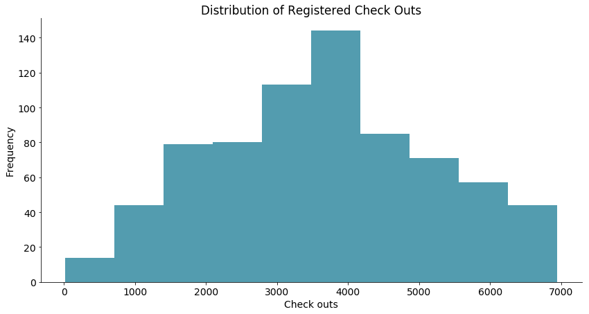
7. 分布分析(灰度图 - 粗略区间计数)
# 绘制灰度图的函数
def histogram(data, x_label, y_label, title):
    _, ax = plt.subplots()
    res = ax.hist(data, color='#539caf', bins=10)  # 设置bin的数量
    ax.set_ylabel(y_label)
    ax.set_xlabel(x_label)
    ax.set_title(title)
    return res


# 绘图函数调用
res = histogram(data=daily_data['registered'], x_label='Check outs',
                y_label='Frequency', title='Distribution of Registered Check Outs')
res[0]  # value of bins
res[1]  # boundary of bins
8. 堆叠直方图 - 比较两个分布
# 绘制堆叠的直方图
def overlaid_histogram(data1, data1_name, data1_color, data2, data2_name, data2_color, x_label, y_label, title):
    # 归一化数据区间,对齐两个直方图的bins
    max_nbins = 10
    data_range = [min(min(data1), min(data2)), max(max(data1), max(data2))]
    binwidth = (data_range[1] - data_range[0]) / max_nbins
    bins = np.arange(data_range[0], data_range[1] +
                     binwidth, binwidth)  # 生成直方图bins区间

    # Create the plot
    _, ax = plt.subplots()
    ax.hist(data1, bins=bins, color=data1_color, alpha=1, label=data1_name)
    ax.hist(data2, bins=bins, color=data2_color, alpha=0.75, label=data2_name)
    ax.set_ylabel(y_label)
    ax.set_xlabel(x_label)
    ax.set_title(title)
    ax.legend(loc='best')


# Call the function to create plot
overlaid_histogram(data1=daily_data['registered'], data1_name='Registered', data1_color='#539caf', data2=daily_data['casual'],
                   data2_name='Casual', data2_color='#7663b0', x_label='Check outs', y_label='Frequency', title='Distribution of Check Outs By Type')
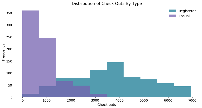
registered:注册的分布,正态分布,why;casual:偶然的分布,疑似指数分布,why;
9. 密度图 - 精细刻画概率分布
KDE: kernal density estimate
# 计算概率密度
from scipy.stats import gaussian_kde

data = daily_data['registered']

# kernal density estimate: https://en.wikipedia.org/wiki/Kernel_density_estimation
density_est = gaussian_kde(data)

# 控制平滑程度,数值越大,越平滑
density_est.covariance_factor = lambda: .3
density_est._compute_covariance()
x_data = np.arange(min(data), max(data), 200)

# 绘制密度估计曲线
def densityplot(x_data, density_est, x_label, y_label, title):
    _, ax = plt.subplots()
    ax.plot(x_data, density_est(x_data), color='#539caf', lw=2)
    ax.set_ylabel(y_label)
    ax.set_xlabel(x_label)
    ax.set_title(title)


# 调用绘图函数
densityplot(x_data=x_data, density_est=density_est, x_label='Check outs',
            y_label='Frequency', title='Distribution of Registered Check Outs')
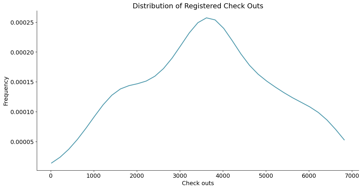
>>> type(density_est)
scipy.stats._kde.gaussian_kde
10. 组间分析(柱状图 - 一级类间均值方差比较)
- 组间定量比较
- 分组粒度
- 组间聚类
# 分天分析统计特征
mean_total_co_day = daily_data[['weekday', 'cnt']].groupby('weekday').agg([
    np.mean, np.std])
mean_total_co_day.columns = mean_total_co_day.columns.droplevel()

# 定义绘制柱状图的函数
def barplot(x_data, y_data, error_data, x_label, y_label, title):
    _, ax = plt.subplots()
    # 柱状图
    ax.bar(x_data, y_data, color='#539caf', align='center')
    # 绘制方差
    # ls='none'去掉bar之间的连线
    ax.errorbar(x_data, y_data, yerr=error_data,
                color='#297083', ls='none', lw=5)
    ax.set_ylabel(y_label)
    ax.set_xlabel(x_label)
    ax.set_title(title)


# 绘图函数调用
barplot(x_data=mean_total_co_day.index.values, y_data=mean_total_co_day['mean'], error_data=mean_total_co_day[
        'std'], x_label='Day of week', y_label='Check outs', title='Total Check Outs By Day of Week (0 = Sunday)')
-af4786f1026367b921b52bff5604dfa7.png)
>>> mean_total_co_day.columns
Index(['mean', 'std'], dtype='object')

>>> daily_data[['weekday', 'cnt']].groupby('weekday').agg([np.mean, np.std])
                 cnt
                mean          std
weekday
0        4228.828571  1872.496629
1        4338.123810  1793.074013
2        4510.663462  1826.911642
3        4548.538462  2038.095884
4        4667.259615  1939.433317
5        4690.288462  1874.624870
6        4550.542857  2196.693009
11. 堆积柱状图 - 多级类间相对占比比较
>>> mean_by_reg_co_day = daily_data[[
>>>     'weekday', 'registered', 'casual']].groupby('weekday').mean()
>>> mean_by_reg_co_day
          registered       casual
weekday
0        2890.533333  1338.295238
1        3663.990476   674.133333
2        3954.480769   556.182692
3        3997.394231   551.144231
4        4076.298077   590.961538
5        3938.000000   752.288462
6        3085.285714  1465.257143
# 分天统计注册和偶然使用的情况
mean_by_reg_co_day = daily_data[[
    'weekday', 'registered', 'casual']].groupby('weekday').mean()
# 分天统计注册和偶然使用的占比
mean_by_reg_co_day['total'] = mean_by_reg_co_day['registered'] + \
    mean_by_reg_co_day['casual']
mean_by_reg_co_day['reg_prop'] = mean_by_reg_co_day['registered'] / \
    mean_by_reg_co_day['total']
mean_by_reg_co_day['casual_prop'] = mean_by_reg_co_day['casual'] / \
    mean_by_reg_co_day['total']


# 绘制堆积柱状图
def stackedbarplot(x_data, y_data_list, y_data_names, colors, x_label, y_label, title):
    _, ax = plt.subplots()
    # 循环绘制堆积柱状图
    for i in range(0, len(y_data_list)):
        if i == 0:
            ax.bar(x_data, y_data_list[i], color=colors[i],
                   align='center', label=y_data_names[i])
        else:
            # 采用堆积的方式,除了第一个分类,后面的分类都从前一个分类的柱状图接着画
            # 用归一化保证最终累积结果为1
            ax.bar(x_data, y_data_list[i], color=colors[i],
                   bottom=y_data_list[i - 1], align='center', label=y_data_names[i])
    ax.set_ylabel(y_label)
    ax.set_xlabel(x_label)
    ax.set_title(title)
    ax.legend(loc='upper right')  # 设定图例位置


# 调用绘图函数
stackedbarplot(x_data=mean_by_reg_co_day.index.values, y_data_list=[mean_by_reg_co_day['reg_prop'], mean_by_reg_co_day['casual_prop']], y_data_names=['Registered', 'Casual'], colors=[
               '#539caf', '#7663b0'], x_label='Day of week', y_label='Proportion of check outs', title='Check Outs By Registration Status and Day of Week (0 = Sunday)')
-534979257047c0db5ba4733183c273b2.png)
- 从这幅图你看出了什么?工作日 VS 节假日;
- 为什么会有这样的差别?
12. 分组柱状图 - 多级类间绝对数值比较
# 绘制分组柱状图的函数
def groupedbarplot(x_data, y_data_list, y_data_names, colors, x_label, y_label, title):
    _, ax = plt.subplots()
    # 设置每一组柱状图的宽度
    total_width = 0.8
    # 设置每一个柱状图的宽度
    ind_width = total_width / len(y_data_list)
    # 计算每一个柱状图的中心偏移
    alteration = np.arange(-total_width/2+ind_width/2,
                           total_width/2+ind_width/2, ind_width)

    # 分别绘制每一个柱状图
    for i in range(0, len(y_data_list)):
        # 横向散开绘制
        ax.bar(x_data + alteration[i], y_data_list[i],
               color=colors[i], label=y_data_names[i], width=ind_width)
    ax.set_ylabel(y_label)
    ax.set_xlabel(x_label)
    ax.set_title(title)
    ax.legend(loc='upper right')


# 调用绘图函数
groupedbarplot(x_data=mean_by_reg_co_day.index.values, y_data_list=[mean_by_reg_co_day['registered'], mean_by_reg_co_day['casual']], y_data_names=[
               'Registered', 'Casual'], colors=['#539caf', '#7663b0'], x_label='Day of week', y_label='Check outs', title='Check Outs By Registration Status and Day of Week (0 = Sunday)')
-2-471293e202fd5b704a8be27a2a357433.png)
偏移前:ind_width/2;偏移后:total_width/2;偏移量:total_width/2-ind_width/2;
13. 箱式图
- 多级类间数据分布比较;
- 柱状图 + 堆叠灰度图;
# 只需要指定分类的依据,就能自动绘制箱式图
days = np.unique(daily_data['weekday'])
bp_data = []
for day in days:
    bp_data.append(daily_data[daily_data['weekday'] == day]['cnt'].values)

# 定义绘图函数
def boxplot(x_data, y_data, base_color, median_color, x_label, y_label, title):
    _, ax = plt.subplots()

    # 设置样式
    ax.boxplot(y_data               # 箱子是否颜色填充
               , patch_artist=True               # 中位数线颜色
               # 箱子颜色设置,color:边框颜色,facecolor:填充颜色
               , medianprops={'color': base_color}               # 猫须颜色whisker
               # 猫须界限颜色whisker cap
               , boxprops={'color': base_color, 'facecolor': median_color}, whiskerprops={'color': median_color}, capprops={'color': base_color})

    # 箱图与x_data保持一致
    ax.set_xticklabels(x_data)
    ax.set_ylabel(y_label)
    ax.set_xlabel(x_label)
    ax.set_title(title)


# 调用绘图函数
boxplot(x_data=days, y_data=bp_data, base_color='b', median_color='r', x_label='Day of week',
        y_label='Check outs', title='Total Check Outs By Day of Week (0 = Sunday)')
-2-0d61106780266c6a0a156e69d3b52e6d.png)
>>> bp_data
[array([ 801,  822, 1204,  986, 1096, 1623, 1589, 1812, 2402,  605, 2417,
       2471, 1693, 3249, 2895, 3744, 4191, 3351, 4333, 4553, 4660, 4788,
       4906, 4460, 4744, 5305, 4649, 4881, 5302, 3606, 4302, 3785, 3820,
       3873, 4334, 4940, 5046, 4274, 5010, 2918, 5511, 5041, 4381, 3331,
       3649, 3717, 3520, 3071, 3485, 2743, 2431,  754, 2294, 3425, 2311,
       1977, 3243, 2947, 1529, 2689, 3389, 3423, 4911, 5892, 4996, 6041,
       5169, 7132, 1027, 6304, 6359, 6118, 7129, 6591, 7641, 6598, 6978,
       6891, 5531, 4672, 6031, 7410, 6597, 5464, 6544, 4549, 5255, 5810,
       8227, 7333, 7907, 6889, 3510, 6639, 6824, 4459, 5107, 6852, 4669,
       2424, 4649, 3228, 3786, 1787, 1796]), array([1349, 1321, 1000, 1416, 1501, 1712, 1913, 1107, 1446, 1872, 2046,
       2077, 2028, 3115, 3348, 3429, 4073, 4401, 4362, 3958, 4274, 4098,
       4548, 5020, 4010, 4708, 6043, 4086, 4458, 3840, 4266, 4326, 4338,
       4758, 4634, 3351, 4713, 4539, 4630, 3570, 5117, 4570, 4187, 3669,
       4035, 4486, 2765, 3867, 3811, 3310, 3403, 1317, 1951, 2376, 2298,
       2432, 3624, 3784, 3422, 3129, 4322, 3333, 5298, 6153, 5558, 5936,
       5585, 6370, 3214, 5572, 6273, 2843, 4359, 6043, 6998, 6664, 5099,
       6779, 6227, 6569, 6830, 6966, 7105, 7013, 6883, 6530, 6917, 6034,
       7525, 6869, 7436, 6778, 5478, 5875, 7058,   22, 5259, 6269, 5499,
       5087, 6234, 5170, 4585,  920, 2729]), array([1562, 1263,  683, 1985, 1360, 1530, 1815, 1450, 1851, 2133, 2056,
       2703, 2425, 1795, 2034, 3204, 4400, 4451, 4803, 4123, 4492, 3982,
       4833, 4891, 4835, 4648, 4665, 4258, 4541, 4590, 4845, 4602, 4725,
       5895, 5204, 2710, 4763, 3641, 4120, 4456, 4563, 4748, 4687, 4068,
       4205, 4195, 1607, 2914, 2594, 3523, 3750, 1162, 2236, 3598, 2935,
       4339, 4509, 4375, 3922, 3777, 4363, 3956, 5847, 6093, 5102, 6772,
       5918, 6691, 5633, 5740, 5728, 5115, 6073, 5743, 7001, 4972, 6825,
...
       5976, 8714, 8395, 8555, 7965, 7109, 8090, 7852, 5138, 6536, 5629,
       2277, 5191, 5582, 5047, 1749, 1341])]

>>> days
[0 1 2 3 4 5 6]
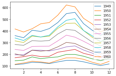
6. 应用案例:航班乘客变化分析
1. 折线图:分析年度乘客总量变化情况
%matplotlib inline
import matplotlib as mpl
from matplotlib import pyplot as plt
import seaborn as sns
import pandas as pd
import ssl
ssl._create_default_https_context = ssl._create_unverified_context

data = sns.load_dataset("flights")
data.head()
# 年份,月份,乘客数
   year month  passengers
0  1949   Jan         112
1  1949   Feb         118
2  1949   Mar         132
3  1949   Apr         129
4  1949   May         121
months_data = {'month': ['January', 'February', 'March', 'April', 'May', 'June', 'July', 'August',
                         'September', 'October', 'November', 'December'], 'month_int': [1, 2, 3, 4, 5, 6, 7, 8, 9, 10, 11, 12]}
months = pd.DataFrame(months_data)
months
        month  month_int
0     January          1
1    February          2
2       March          3
3       April          4
4         May          5
5        June          6
6        July          7
7      August          8
8   September          9
9     October         10
10   November         11
11   December         12
data = pd.merge(data, months, on='month')
data.head(15)
    year     month  passengers  month_int
0   1949   January         112          1
1   1950   January         115          1
2   1951   January         145          1
3   1952   January         171          1
4   1953   January         196          1
5   1954   January         204          1
6   1955   January         242          1
7   1956   January         284          1
8   1957   January         315          1
9   1958   January         340          1
10  1959   January         360          1
11  1960   January         417          1
12  1949  February         118          2
13  1950  February         126          2
14  1951  February         150          2
import numpy as np
x = np.arange(1,13)
for name, group in data.groupby('year'):
#     print(name)
    plt.plot(x, group['passengers'], label=name)
    plt.legend(loc='upper right')
#     print(group[['month_int', 'passengers']])
2. 柱状图:分析乘客在一年中各月份的分布
data_month = pd.merge(data.groupby('month').sum()[
                      ['passengers']], months, on='month').sort_values(by='month_int')
plt.bar(data_month['month_int'], data_month['passengers'])
plt.plot(data_month['month_int'], data_month['passengers'])

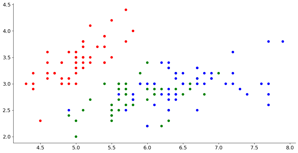
7. 应用案例:鸢尾花花型尺寸分析
1. 散点图:萼片(sepal)和花瓣(petal)的大小关系
data = sns.load_dataset('iris')
iris_colors = pd.DataFrame(
    {'species': ['setosa', 'versicolor', 'virginica'], 'colors': ['r', 'g', 'b']})
data_colors = pd.merge(data, iris_colors, on='species')
# data_colors
plt.scatter(data_colors['sepal_length'],
            data_colors['sepal_width'], c=data_colors['colors'])
2. 分类散点子图:不同种类(species)鸢尾花萼片和花瓣的大小关系
data = sns.load_dataset("iris")
data.groupby('species').sum()
# 萼片长度,萼片宽度,花瓣长度,花瓣宽度,种类
            sepal_length  sepal_width  petal_length  petal_width
species
setosa             250.3        171.4          73.1         12.3
versicolor         296.8        138.5         213.0         66.3
virginica          329.4        148.7         277.6        101.3
还可以探索柱状图或者箱式图:不同种类鸢尾花萼片和花瓣大小的分布情况;
8. 应用案例:餐厅小费情况分析
- 散点图:小费和总消费之间的关系;
- 分类箱式图:男性顾客和女性顾客,谁更慷慨;
- 分类箱式图:抽烟与否是否会对小费金额产生影响;
- 分类箱式图:工作日和周末,什么时候顾客给的小费更慷慨;
- 分类箱式图:午饭和晚饭,哪一顿顾客更愿意给小费;
- 分类箱式图:就餐人数是否会对慷慨度产生影响;
- 分组柱状图:性别 + 抽烟的组合因素对慷慨度的影响;
data = sns.load_dataset("tips")
data.head()
# 总消费,小费,性别,吸烟与否,就餐星期,就餐时间,就餐人数
   total_bill   tip     sex smoker  day    time  size
0       16.99  1.01  Female     No  Sun  Dinner     2
1       10.34  1.66    Male     No  Sun  Dinner     3
2       21.01  3.50    Male     No  Sun  Dinner     3
3       23.68  3.31    Male     No  Sun  Dinner     2
4       24.59  3.61  Female     No  Sun  Dinner     4
9. 应用案例:泰坦尼克号海难幸存状况分析
- 堆积柱状图:不同仓位等级中幸存和遇难的乘客比例;
- 堆积柱状图:不同性别的幸存比例;
- 分类箱式图:幸存和遇难乘客的票价分布;
- 分类箱式图:幸存和遇难乘客的年龄分布
- 分组柱状图:不同上船港口的乘客仓位等级分布;
- 分类箱式图:幸存和遇难乘客堂兄弟姐妹的数量分布;
- 分类箱式图:幸存和遇难乘客父母子女的数量分布;
- 堆积柱状图或者分组柱状图:单独乘船与否和幸存之间有没有联系;
data = sns.load_dataset("titanic")
data.head()
# 幸存与否,仓位等级,性别,年龄,堂兄弟姐妹数,父母子女数,票价,上船港口缩写,仓位等级,人员分类,是否成年男性,所在甲板,上船港口,是否幸存,是否单独乘船
   survived  pclass     sex   age  sibsp  parch     fare  ...  class    who adult_male  deck  embark_town alive  alone
0         0       3    male  22.0      1      0   7.2500  ...  Third    man       True   NaN  Southampton    no  False
1         1       1  female  38.0      1      0  71.2833  ...  First  woman      False     C    Cherbourg   yes  False
2         1       3  female  26.0      0      0   7.9250  ...  Third  woman      False   NaN  Southampton   yes   True
3         1       1  female  35.0      1      0  53.1000  ...  First  woman      False     C  Southampton   yes  False
4         0       3    male  35.0      0      0   8.0500  ...  Third    man       True   NaN  Southampton    no   True
- 上一篇:「Python 机器学习」Pandas 数据分析
- 专栏:《Python 基础》 | 《机器学习》
PS:欢迎各路道友阅读与评论,感谢道友点赞、关注、收藏!